
Blank Archive
When Blank Archive’s ecommerce website wasn’t converting visitors into customers as effectively as expected, I was brought in to redesign the shopping experience.
Using website analytics and a UX audit to identify opportunities for improvement, I created a clearer, more intuitive experience focused on product discovery and purchase. In the week following launch, sales conversions increased by 88.9%.
Please note this website is no longer live.
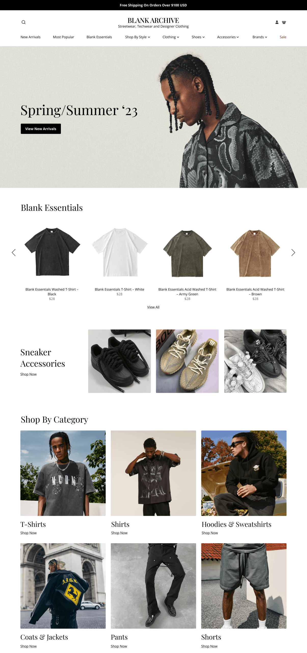
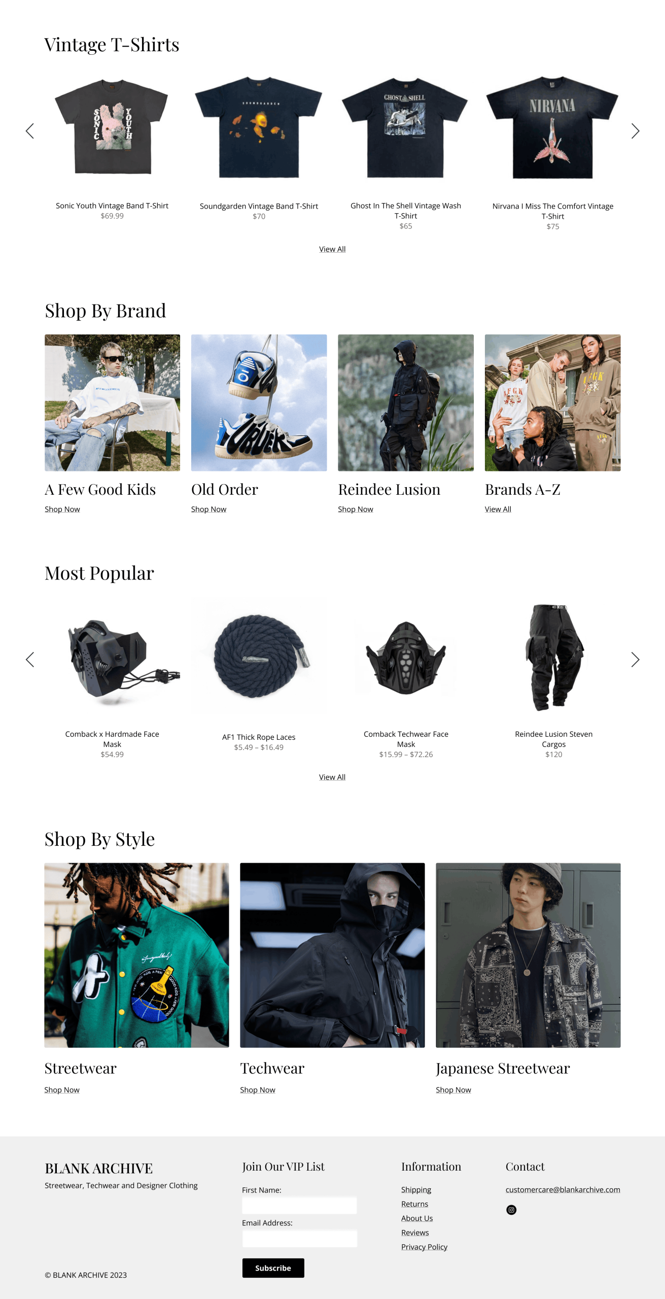
About
Blank Archive is an independent ecommerce clothing store specialising in men’s streetwear, techwear, and designer clothing. The goal was to improve the shopping experience while maintaining the brand’s clean, minimal aesthetic.
Using website analytics and a UX audit, I identified opportunities to make product discovery more intuitive, improve the clarity of product pages, and create a more straightforward path to purchase. Visually, the redesign retained the brand’s understated aesthetic, using clean layouts, considered spacing, and a clear content hierarchy to keep the focus on the clothing. With over 75% of visitors accessing the site on mobile, the design also prioritised a seamless, responsive experience across devices.

“Lydia is a talented designer with a real focus on getting results. She kept us updated during every step of the project. The website redesign exceeded our expectations.”
Blank Archive
Features
Improved product categorisation
I reorganised the product categories to make the growing collection easier to navigate, allowing customers to browse specific clothing styles and find relevant products more easily.
Optimised product pages
I refined the product page layouts to give key information, sizing, and social proof greater prominence. I also simplified the purchase options to create a clearer visual hierarchy and a more focused path to checkout.
Clean, responsive design
I retained Blank Archive’s minimal aesthetic through clean layouts, considered spacing, and a strong focus on product imagery. The responsive designs were tailored to the brand’s predominantly mobile audience, creating a consistent shopping experience across devices.
More Case Studies
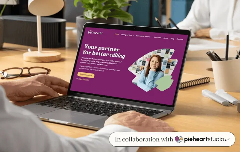
The Better Edit
A bold, personality-filled website for Hazel Bird’s rebrand from Wordstitch Editorial to The Better Edit.

Ellena Smith
A carefully crafted website that guides visitors from first impression to inquiry, inspired by wedding-day keepsakes.
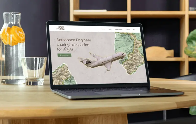
Flying Callum
Callum's website is designed to communicate a sense of wonder around what flying can do for you.