
The Better Edit
When Hazel Bird rebranded her business from Wordstitch Editorial to The Better Edit, she needed a high-impact website to support the new direction.
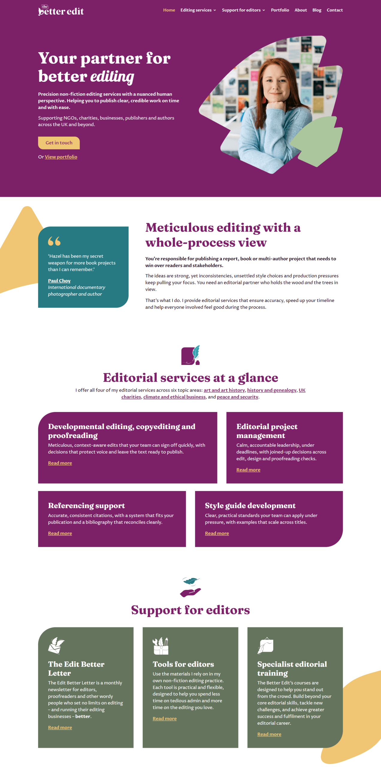
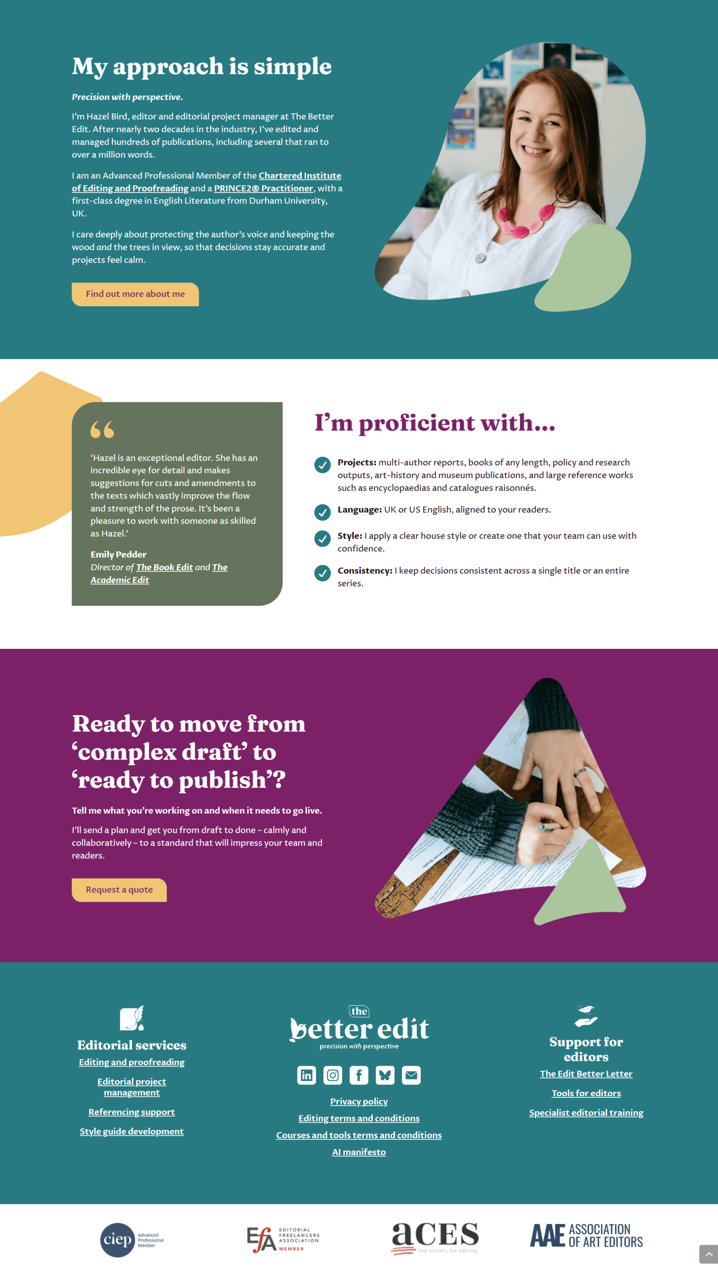
Working with the team at Pie Heart Studio, I designed and built a distinctive, personality-filled website that reflects her expanded focus, presenting her editorial services to clients while also supporting her growing platform for editors looking to improve their craft.
Please note that websites may be changed by the client post-launch.
About
The website builds on the strategy, branding, and copy developed by the Pie Heart Studio team. My role was to translate this work into a fast, easy-to-manage site that clearly communicates Hazel’s expertise while supporting the broader direction of her rebrand.
The structure allows the site to serve two audiences without feeling divided. Potential editing clients can quickly understand Hazel’s services and experience, while editors discovering her through blog content can explore her courses and professional resources. The visual design carries the new brand identity across the site through carefully crafted layouts that incorporate bold colour, distinctive abstract shapes, and photography of Hazel to create a recognisable and personal online presence.


“Her designs are beautiful, user friendly and always extremely well adapted for the target audience. Lydia is excellent at following a brief with a high level of attention to detail, but she also has a lot of intuition and an innate understanding of UX, which means I can trust her completely to make design decisions for our clients at Pie Heart Studio.”
Beth Rawlins, Pie Heart Studio
Features

Conversion-focused layout
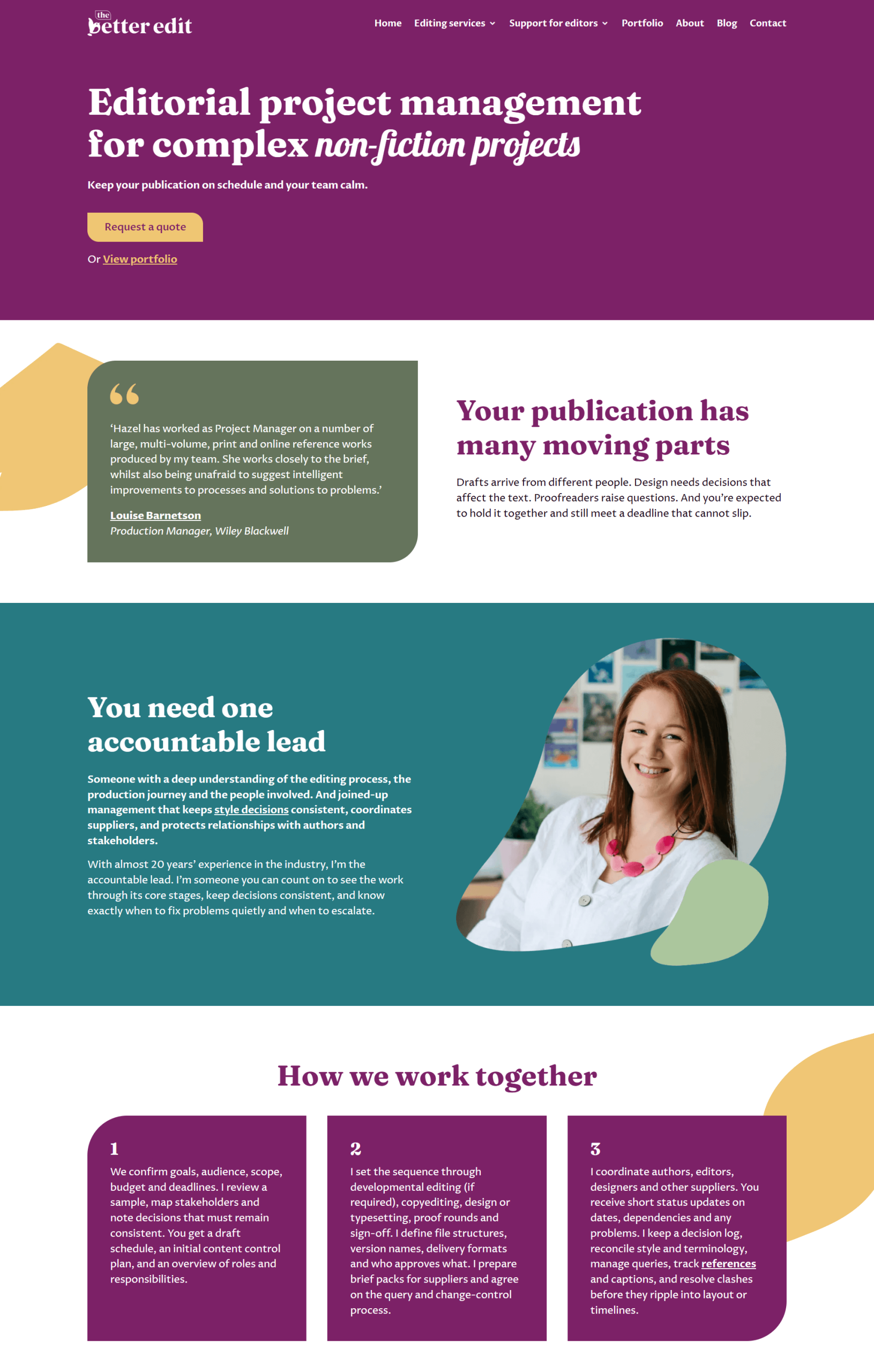
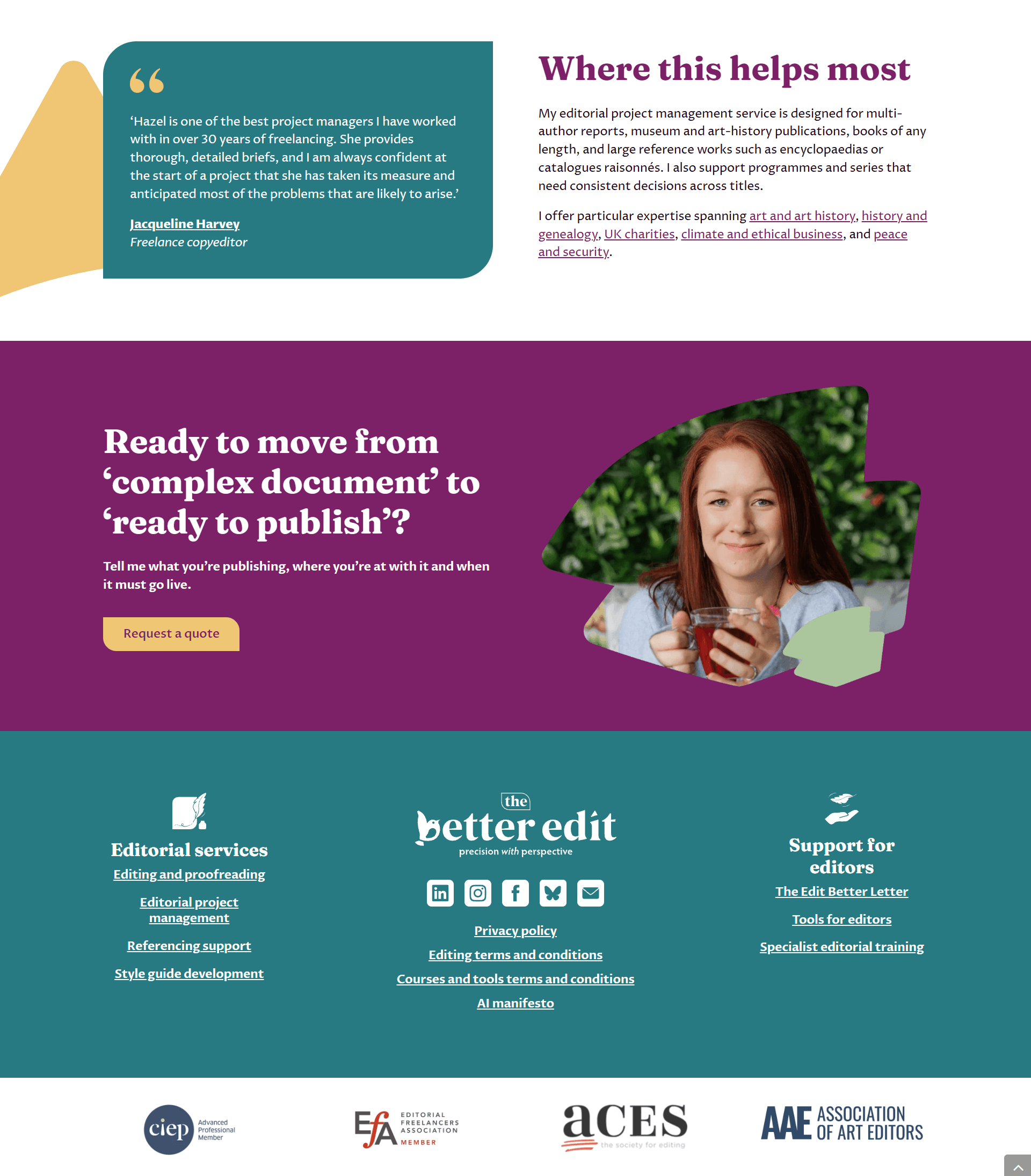
Key pages guide visitors through Hazel’s expertise, services, and approach, with well-placed calls to action and social proof encouraging visitors to take the next step.

Clear pathways for two audiences
The site structure makes it easy for two different audiences to find what they need. Editorial clients are guided through clear service pages, while editors arriving via blog content can quickly discover Hazel’s courses and tools.

Bold colour and typography
The vibrant colour palette and confident typography give the site a distinctive visual identity. Colour combinations were carefully chosen to meet accessibility contrast standards across the site.
More Case Studies
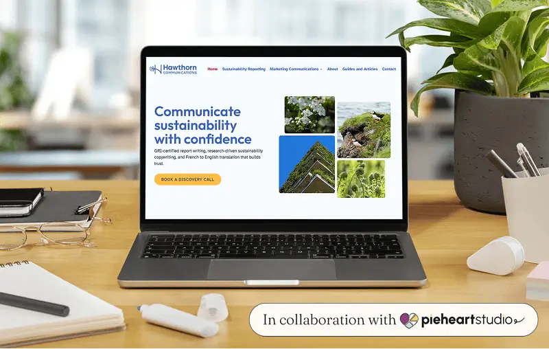
Hawthorn Communications
A clean, professional website that brings Hawthorn Communications’ sustainability-focused rebrand to life online.

Ellena Smith
A carefully crafted website that guides visitors from first impression to inquiry, inspired by wedding-day keepsakes.

Blank Archive
A conversion-focused redesign for Blank Archive, delivering an 88.9% increase in sales conversions in the week after launch.